Research and Branding with the Lowercase 'e' designed by Pentagram.
Role
UX Researcher, Identity designer
Year
2018
Deliverables
Research report
Brand Guidelines
Audit + strategy
Teams involved
Marketing
Research
Brand & Creative

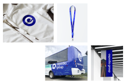
We developed a cohesive visual language that unified the Expedia Group brand and provided a consistent user experience across touch-points.
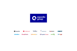
Our research involved examining the visual characteristics of Pentagram’s ‘e’, including its shape, color, and typography, and assessing how it can be adapted to all the other family of brands with their unique identity.
By utilising Pentagram’s design expertise and our own research insights, we were confident that the new branding would have a significant impact on the audience and strengthen the brand’s recognition in the marketplace.
HEX: 000099
CMYK: 100, 98, 5, 6
PMS: 072 C
HEX: 58DFB8
CMYK: 55, 0, 40, 0
PMS: 3375 C
HEX: 0000FD
CMYK: 89, 77, 0, 0
PMS: 2369 C
HEX: B6DBFF
CMYK: 25, 6, 0, 0
PMS: 2717 C
⸺ Qualitative Research
Before embarking on the rebrand, it was important to have a clear understanding of our target audience and how EG was perceived in the marketplace. We executed several strategic positioning exercise to help identify the unique value proposition and ensure the rebranding effort would align with the business goals at the time.
⸺ Visual identity
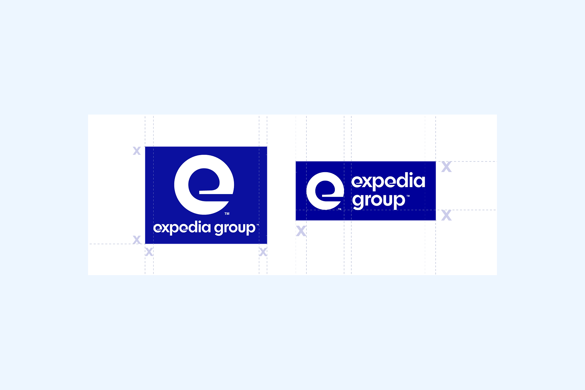
Updates of all the visual identity. This includes logo variations, colour palette, and typography (provided by Pentagram). A strong visual identity is essential for brand differentiation. From insight we found that it was important to strike a balance between modern look and consistency with the existing brand equity.
⸺ Messaging
Another key aspect of B2B rebranding is messaging. This includes the tone and voice used in marketing and product, as well as the messaging around your brand's unique value proposition. We worked with the content team to come up with a clear and concise messaging that would resonate with our target audience.
⸺ Online presence
This B2B rebrand involved product and design system redesign, marketing materials updates such as, websites, social media, internal communications and more.
⸺ Internal communications
This includes educating employees on the new brand identity and messaging, as well as ensuring that all internal processes and materials were updated to reflect the new brand.
⸺ Rollout strategy
This includes planning the launch of your new brand across all channels, including social media, email marketing, and advertising. A strong rollout strategy was key to help generate excitement around the new brand, and ensure a smooth transition.